NZDCAD/Pair trade: Just short everything...I like to go short, I find the best trades I take are shorts, not sure why, but it's true.
Here we have 3 short opportunities, which are linked by correlations.
The NZDCAD ratio chart, or exotic pair if you want to call it that is offering us a nice trend continuation opportunity.
I will use this as a way to hedge my exposure to a more aggressive and more of a 'long shot' trade that I want to take in USDCAD, which is a short under the last daily low (and a second entry a bit lower). The trend was strongly up but rgmov has peaked before the last top, and the time at mode trend signal has expired in the daily.
It's possible this is an intermediate correction before a new leg up, that I have no way to know (I do have a projected top target a bit higher) but it's looking like a compelling short sell right here, right now.
As for NZDUSD, everyone and their mother wants to find the market bottom, but that's usually a hard and risky endeavor, so I will short in the face of range expansion resistance, and a clear downtrend with a nice push up thanks to the gold short squeeze rally, which gives us a nicer entry and clear stop location.
Here's the entry and sl parameters (if you trade the individual pairs, I will be trading with no stop loss on the *usd pairs, and with a stop and lower leverage in nzdcad):
NZDCAD: Entry under last daily low, stop above the last highest high. Target is a retest of the lowest low at least.
USDCAD: Entry under last daily low, stop above the highest high, no tp but watch levels on chart. Second entry at 1.29157, same SL. Splitting this in two equal risk % is a good idea.
NZDUSD: Entry under last daily low, stop above the highest high, no tp. Simple...
If you want to trade the no SL pair trade setup, find the ADR of each pair (which is /4) and then base position size on risking the desired percentage of your capital on the whole position. Adjust the smaller ADR pair position size by the result of dividing the larger ADR by the smaller one.
Here I get:
USDCAD: 99.5 pips per day
NZDUSD: 92.1 pips per day
So, 99.5/92.1=1.080347448425624.
Thus, we risk 1-5% on each side of the trade, but the smaller ADR one is multiplied by 1.080347448425624 to get the correct lot size.
That's how I trade these at least.
See related ideas for my longer term view on gold, and other important correlations. Special shout out to jangseohee, he brought the nzdcad chart to my attention again. His ideas are linked there too.
Good luck,
Ivan.
Search in ideas for "RATIO CHART"

Update on VIX /VXV - Volatility contango intact but muted.Volatility traders over the last weeks have been seeing a "flattening" of volatility structure and have not been getting the returns they were expecting for contango trades. (If you want to see contango at work, pull up a 5 year chart of UVXY. Those losses? Contango.)
These charts show what is happening. The VIX (short term volatility) is rising from its depressed levels in late May while VXV (90 day volatility) is rising at a slower rate from a deeper fall in May. Why is that important? Remember that all of these volatility ETNs / ETFs have "roll." Roll is the daily sale of short term volatility and purchase of mid term volatility. Where do they get their supply of short term volatility to sell? From holding the mid term until it becomes short term. Just about any volatility symbol you can buy or sell employs such a strategy.
So how does that create a flattened volatility structure? Simple. On some days that the VIX spikes a bit, those short term volatility sales (purchased as mid term contracts weeks before, when the VXV was depressed too) are actually profitable. Normally there is loss due to theta and risk premium. But all futures players know that the key to winning is entering and exiting at a price move before theta and premium gets you. Well these ETFs are doing that on a few days here and there by pure luck. Most days theta and risk premium produce the deep contango that vol traders love. Do the math - as the VIX slowly rises so will the VXV, but if the VIX leads (which it is doing now) then there will be more days where those purchased-as-mid-term-and-sold-as-short-term vol contracts pay. Certainly not every day - just some days.
The structure is flattening also in part due to the volume of trades these ETFs / ETNs (and the array of HFT systems that arbitrage them and their underlying trades) generate. There is a "tail wagging the dog" effect that this volume has created that didn't exist when vol futures were only affected by OTM Put bidding on the S&P. More and more trades bypass OTM Puts and go straight to volatility. The VIX itself doesn't "see" those trades (partly why it is historically low and is likely to stay low.)
The VIX/VXV ratio chart on the left shows us this "flattening" as we touch that magic .9 threshold that induces backwardation fear. I placed an indicator underneath it that shows the contango rate movement of one of the highest volume vol ETNs out there - my fav of favs, UVXY. The orange line is the daily contango rate. A spike above 1 generally means the contracts rolled that day were at a profit and below at a loss. The white and black lines are smoothing functions. Notice the black line rising slightly but still under 1? That means one thing: Volatility contango is intact but muted.
The VIX will bounce around day to day and should continue rising such that we see spikes into 17s once in a while again. So there will be more days where the roll is a winner. But over all it remains a loser. Just look again at that 5 year UVXY chart.

GM - Review of Entry Long in October and Exit in February -RatioHere is another way to look at trade ideas - relative to the S&P500.
Ratio charts allow you to quickly see how one asset is performing relative to another and if you go "LONG GM" in this example, you are really choosing to own GM instead of the "Market". So, it is important to be good and make money on your ideas, but if you had made more money by just owning the market, then in reality you really aren't benefiting from all of the hard work and effort of stock picking.
You can also see that since exiting in February GM has fallen relative to the market. I can add GM and SPY to this chart so you can see which market drove the ratio up and down, but in this case GM has fallen and the market has risen since February.
Small note: I multiplied GM by 100 so that the resultant ratio would be similar to a stock price that you are familiar with: 16.76 last instead of 0.1676.
The ratio changes are highlighted using the "Price Range" function on the drawing tools menu.
Wishing you all success, relative to the market.
Cheers,
Tim
April 24, 2015 11:46AM EST GM*100/SPY = 16.77 last

Gold - Has Not Lost It's Glitter Yet.In my last Gold chart I published I gave 1100 zone or little lower as possible area where significant low would form. Then subsequently I updated with saying that I am reducing my downside expectation and would be willing see low form even above 1100. Please check these for background.
Many of course would dismiss these comments as they maintain the view of continued weakness for gold.
I am very intrigued that most analysts and institutions were expecting gold to continue higher and from a new high above Nov 2011 when prices were around 1500. I have in my previous charts maintained that would they would be disappointed and once 1500 gave way we could be looking for 1300 and then to sub 1200.
Many could have used fundamentals and their extensive knowledge to support their views noted above.
However those bulls were severely tested in their resolve as gold continued its relentless decline. Even the most notable Bulls such as John Paulson the Hedge Fund Manager reputed to have made billions from his deal in toxic assets started to sell down his gold exposure and in mid 2013. Similarly, another successful Fund Manager in UK started to conclude that gold has no chance of recovery anytime soon having held his position all the ways from high, so in Mid 2014 considered it is wise to reduce his exposure to Gold.
Drop in inflation expectation and Dollar strength has not been supportive of gold going higher. That now seems to be perceived wisdom.
We might not have seen classic capitulation you often see at the low by climatic drop in price accompanied by massive volume. This makes it hard to make a call on Gold.
Nevertheless, the above high profile bulls along with now ever increasing bears calling for gold dropping to sub 800, suggests to me that it is time to take look at possible bullish move for gold to at least 1500 or retest the Nov 2011 high.
My Elliott Wave counts suggest to me the Nov 2011 high was wave (iii) if correct then we could have completed wave (iv) and now poised to progress in (V) which could at least retest Nov 2011 high. If not then we might retrace 50% of the overall decline and 1500 looks ideal.
Technicals:
1. Bearish sentiments as noted above
2. RSI divergence at potential support level.
3. MACD potentially bullish crossover.
4. Move down from Nov 2011 high appears to be double zigzag with most recent congestion prior to last leg was triangle. Normally the move out of it is terminal (though the minor 5 waves out of triangle looks relative small). Therefore, whilst happy to take this as favouring bullish move (some caution is warranted)
4. Gold/Silver ratio chart suggest potential bottom for both could already in place. See separate chart.
5. Timing wise not significant but notable is that the move of 1999 low to Nov 2011 high took 144 monthly bars and 72 bar for move from Nov high to recent low, ie 50%.
6. See intraday chart which again whilst not conclusive suggest we have minor wave (i) in the form of rising wedge and retracement for wave (ii) are complete. This has happened when Dollar was particularly strong. So if correct we should move strong above 1250 to give conviction to our overall bullish view.
Conclusion:
Even if we are premature in suggesting the low is in, I would not short gold anymore as it become too risky. Rather I would now actively look for confirmation of long trade.
As always, please do your own analysis before making any trade plans. select to follow me and the chart for notification of any future updates. If you like my analysis, indicate this with thumbs-up and comments. If you have alternative view please feel free to share this with details for all to learn from.
Thank you for taking the time to view my analysis.
DanV

The aLTCoin Market's Moment Of Truth Is Upon Us!I wanted to prepare a chart to illustrate the current predicament Litecoin & to a greater extent, the entire altcoin market now finds itself in.
First a brief explanation of the format:
Green boxes show the beginning of a major rally in Litecoin's value in both USD (fiat) & BTC (ratio). These also mark the beginning of a lower support line for LTC when priced in BTC (the lite blue lines).
White boxes show the effect the ratio trade has on the fiat trade when the lite blue support line is tested. Notice how the uptick in fiat value is short lived when this occurs when Litecoin's value is central of it's historic fiat trading range, displayed by the dark blue support & resistance lines on the fiat chart.
The Purple box shows that even when this lite blue ratio support line is broken, it is of little significance while the fiat value is central of it's historic trading range (the dark blue lines).
Finally this brings us to the yellow box. You will notice on both the fiat & ratio chart Litecoin has now almost run out of bear territory. It will either break support, or the bulls will chase it onto higher ground. That much is obvious.
Breaking the ratio support line at this point in time in the current market cycle is nothing new, and it may even be argued that it's historically overdue. But to do so at this moment would also result in a break of support in Litecoin's fiat value! This has only ever happened once, since Litecoin's inception, for but a brief moment during a flash crash way back on the 25th October 2012. This time though the bears have worked Litecoin's fiat value down into this predicament.
Right now, Litecoin is either the most undervalued coin on the crypto market. Or what the Bitcoin purist have been saying about Litecoin & the entire altcoin market, was right all along.
Personally I'm hoping this is a new bottom for Litecoin.

BUY Crude Oil (OIL), SELL SHORT Chevron (CVX)How is it that crude oil is so far out of sync with the price of energy stocks?
This chart shows you very clearly how they move together, but at times they reach extremely far apart. After an extreme, they come back together in a dramatic fashion.
I can't wait until Tradingview has ratio charts so you can see what the ratio chart looks like.
The lift in crude oil futures today and the drop in CVX could be the beginning of the closing of this very wide spread.
I believe the upside here is 10% over the next month with a downside risk of 5%. Since this is a pairs trade, don't just cherry pick one side of this trade because I don't know which side of the trade will generate the profit. It could be that CVX falls and OIL stays the same.
Technical Tim
Wed, Oct 10, 2012 12:40AM EST

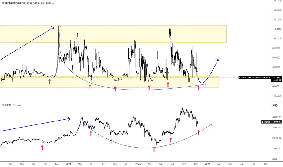
Ethereum Is Approaching SupportEthereum has been slowing down since August, but the wave structure remains slow, choppy, and overlapping, which suggests a correction within an ongoing uptrend. The ideal support area appears to be around the 3000 level.
One of the main reasons Ethereum may find support is the ETHUSD Longs/Shorts ratio chart, which came back to the lower end of its range. This indicates that many speculators are attempting to short the market while giving up on long positions.
If we take past cycles into account, Ethereum may experience limited weakness. Therefore, keep an eye out for a potential rebound and a bullish continuation, while the ETHUSD Longs/Shorts ratio chart could move back toward the upper side of its range.
$CRWD: Secular outperformer in Cybersecurity. CrowdStrike is the bellwether of the cybersecurity sector. I have time and again reiterated my bullish thesis on the $CRWD.
In May I said the near-term target is 500 $.
NASDAQ:CRWD : Exceptional performance. Next stop 500 $. for NASDAQ:CRWD by RabishankarBiswal — TradingView
In June I reiterated my price target of 520 $ and said that the stock is headed to 700 $ in the long term.
NASDAQ:CRWD : Relative outperformance compared to its peers for NASDAQ:CRWD by RabishankarBiswal — TradingView
Since then, we have decisively broken above 520 $ and if the momentum continues then by end of Jan 2026, we might see a 700 $ stock.
In the chart below I have plotted the ratio chart between the cybersecurity ETF AMEX:HACK vs $CRWD. In the last 5 years stock has continually outperformed. I think the outperformance continues into 2026 and 2027.
Trade Set Up : Stay bullish on NASDAQ:CRWD over $HACK. 700 $ in sight and 1500 $ by 2027.

BTCUSD/XAUUSD where is the probability of equilibrium? 17/Oct/25BTCUSDXAUUSD ratio chart shown there is multi top pattern near 41 raio with price breaking the long term uptrend line. The Next major support could be at 1?! Gosh! BTC (fake money/ digital gold) same value with Gold ( real money /analog gold)?! WT....

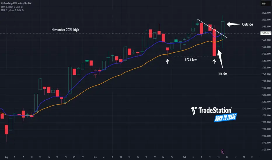
Small Caps: Finally a Breakout?The Russell 2000 has been stuck in a rut for years, but some traders may think the small-cap index has finally achieved escape velocity.
The first pattern on today’s chart is the November 2021 high around 2,460, where prices stalled last November. RUT has gotten above it this month and refused to stay below. Is a breakout finally underway?
Second is the September 25 low of 2,394. Prices tested and held that level last week, which may confirm support is in place.
Third, the index had a bullish inside candle after Friday’s selloff, followed by a bullish outside bar. That may reflect buyers are gaining control.
Next, RUT has apparently broken a trendline that began with the high on October 6.
Finally, consider this weekly ratio chart of the Russell 2000 against the Nasdaq-100. Notice how RUT outperformed in late 2023 and July 2024. Both of those moments saw expectations of Federal Reserve rate cuts. (Such moves often favor small caps.) Notice how the ratio is climbing again at the same time that investors look for more dovishness from the central bank.
TradeStation has, for decades, advanced the trading industry, providing access to stocks, options and futures. If you're born to trade, we could be for you. See our Overview for more.
Past performance, whether actual or indicated by historical tests of strategies, is no guarantee of future performance or success. There is a possibility that you may sustain a loss equal to or greater than your entire investment regardless of which asset class you trade (equities, options or futures); therefore, you should not invest or risk money that you cannot afford to lose. Online trading is not suitable for all investors. View the document titled Characteristics and Risks of Standardized Options at www.TradeStation.com . Before trading any asset class, customers must read the relevant risk disclosure statements on www.TradeStation.com . System access and trade placement and execution may be delayed or fail due to market volatility and volume, quote delays, system and software errors, Internet traffic, outages and other factors.
Securities and futures trading is offered to self-directed customers by TradeStation Securities, Inc., a broker-dealer registered with the Securities and Exchange Commission and a futures commission merchant licensed with the Commodity Futures Trading Commission). TradeStation Securities is a member of the Financial Industry Regulatory Authority, the National Futures Association, and a number of exchanges.
TradeStation Securities, Inc. and TradeStation Technologies, Inc. are each wholly owned subsidiaries of TradeStation Group, Inc., both operating, and providing products and services, under the TradeStation brand and trademark. When applying for, or purchasing, accounts, subscriptions, products and services, it is important that you know which company you will be dealing with. Visit www.TradeStation.com for further important information explaining what this means.
XPTUSD, Platinum ready for parabolic movePlatinum is breaking out after roughly two months of consolidation. Anticipating a parabolic Wave 3 with defined targets. Ratio charts of XPTUSD versus XAGUSD/XAUUSD suggest platinum will outperform gold and silver moving forward.
If you like this analysis, please share and boost! :)

XAG/SPX, Silver & Silvers Miners to outperform SPX equitiesSilver has broken out of a prolonged consolidation phase compared to the S&P 500, as evident in the ratio chart. Going forward, silver as well as silver miners are expected to outperform equities.
As highlighted in my previous posts, I pointed out the strong potential for silver miners and silver to deliver superior returns.
If you like this idea, please boost and share!

$NVDA rolling over. $SMH looks vulnerableSemis have been the toughest pillar of this bull market. The Semis ETF NYSE:SM has been making new highs and new lows with occasional consolidation. NASDAQ:NVDA has been instrumental in the dominance of NASDAQ:SMH in most of the thematic ETFS. The ratio chart $NVDA/ NASDAQ:SMH is also showing signs of weakness and rolling over hard. Last time NASDAQ:NVDA lost momentum it fell 40%. Will the history repeat? History usually rhymes. So, when we see weakness in the largest stock in SP:SPX the indices will also roll over. The momentum weakness is visible in the RSI.
If we believe that the previous highs act as support, then we can expect the stock to drop to 150 $. This aligns with the 1.0 Fib retracement level. This can mark a 17% downturn from here. The next support is around 120 $. That will mark a 33% pull back which is not unusual for $NVDA. But these price level will be great accumulation point for the stock. The consolidation in NASDAQ:SMH and NASDAQ:NVDA was predicated by me on Aug 3. But our long-term target remains intact with NASDAQ:NVDA @ 250 and NASDAQ:SMH @ 315.
Verdict: NASDAQ:NVDA and NASDAQ:SMH looks vulnerable here. Price consolidation more likely providing good entry points in $NVDA. Long term target still holds.

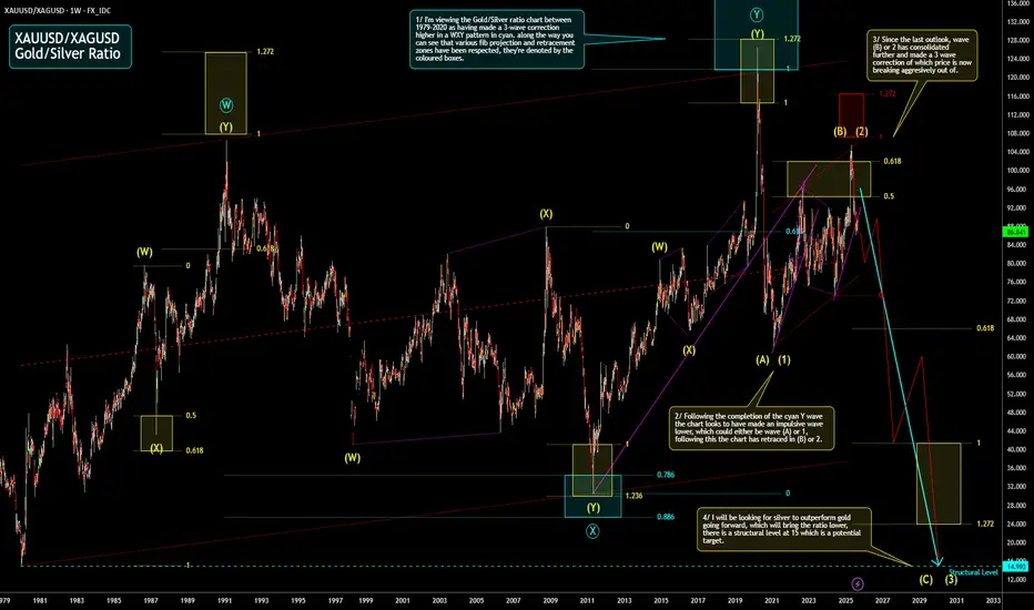
Gold/Silver Ratio Weekly Outlook Here is my weekly outlook on the TVC:GOLD TVC:SILVER ratio. I'm expecting the ratio chart to continue to drop which will mean silver will continue to outperform Gold. I have highlighted a structural level at 15 which is a potential target.
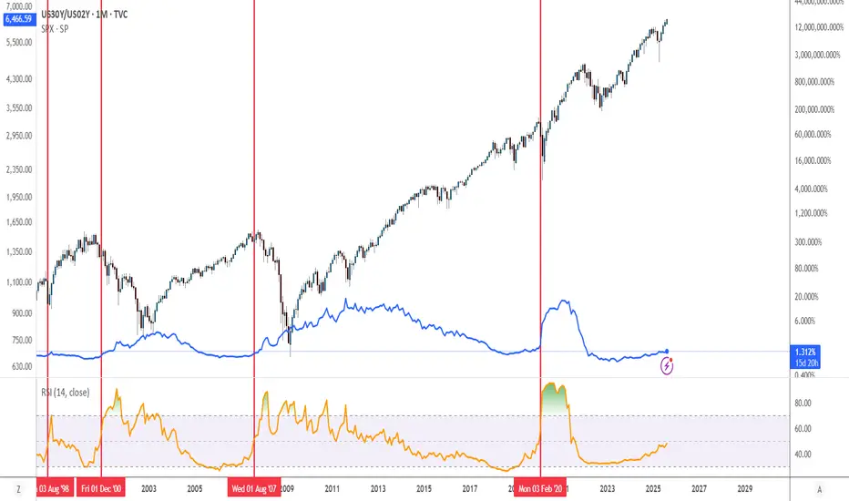
US30Y/US02Y Ratio Chart Crash PreditionAnytime the RSI hits 50% on the US30Y/US02Y ratio a crash soon proceeds when on a monthly timeframe. This only works on the monthly timeframe, it will not work on other timeframes.
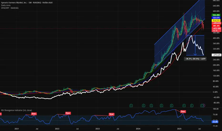
$SFM vs XRT: SFM losses momentum. Underperforming XRT. Within the SPDR Select Sector Retail ETF AMEX:XRT there are very few stocks which consistently outperform the ETF itself let alone the $SPX. We have time and again focused on the momentum name Sprout Farmers within the ETF. NASDAQ:SFM being a momentum stock tend to outperform the SP:SPX and AMEX:XRT on a long-term basis. But recent tariff related issues have created an air pocket for the stock. The stock is already below its 20, 50, 100 and 200-Day SMA. This has been typically countercyclical bullish indicator for the buyers of the stock. This is exactly what happened in 2021 and since then the stock already has provided a 700% return from the lows of 21 $.
But with recent poor price action the stock will have a death cross in a few weeks if this continues. The ratio of NASDAQ:SFM / AMEX:XRT is a bullish chart with higher highs and higher lows. Recently the ratio chart has fallen by 30%. So NASDAQ:SFM has underperformed the AMEX:XRT by 30%. The reasons can be multi-faceted from consumers pulling back to squeezed margins due to tariffs. But with RSI still above 40 we are still not in oversold territory. In my opinion the stock will have some more tough days, and we cannot rule out a minor pullback before we hit the historical low in RSI of 25 before we can hit the buy button.
Verdict: NASDAQ:SFM chart is bearish. Lost momentum. Price can go below 100 $ and RSI to 25 before the washout is complete.
AAPL/SPY ratio + AAPL Weekly Triangle TradeIn this video I cover the weekly Triangle pattern, with explaining my current trade and what moves I am prepared for. I also cover the AAPL/SPY ratio chart and why this may be useful when trading AAPL.

Jindal SteelAnother strong candidate from the metal sector. Huge consolidation and VCP in ratio charts show that it can be good candidate provided metal sector start working


Technology ETF Flirts with New HighsTechnology stocks have been coming to life recently, and some traders may expect new highs soon.
The first pattern on today’s chart of the SPDR Select Sector Technology Fund is last July’s peak around $238. As the fund retreated from that level, it began a period of underperformance. (See ratio chart in the lower study.) The weakness continued through April, when it started to outpace the broader market again.
Second is $240.84, the final price on December 6 and the highest weekly closing price ever. XLK is on track to potentially surpass that level, which could confirm a breakout.
Third, the 50-day simple moving average (SMA) is nearing a potential “golden cross” above the 200-day SMA. Is the longer-term trend turning bullish again?
Finally, price action in this fund could be important for the broader market because technology represents almost one-third of the S&P 500 index.
Standardized Performances for the ETF mentioned above:
SPDR Select Sector Technology ETF (XLK)
1-year: +9.87 %
5-years: +135.69%
10-year: +432.42%
(As of May 30, 2025)
Exchange Traded Funds ("ETFs") are subject to management fees and other expenses. Before making investment decisions, investors should carefully read information found in the prospectus or summary prospectus, if available, including investment objectives, risks, charges, and expenses. Click here to find the prospectus.
Check out TradingView's The Leap competition sponsored by TradeStation.
TradeStation has, for decades, advanced the trading industry, providing access to stocks, options and futures. If you're born to trade, we could be for you. See our Overview for more.
Past performance, whether actual or indicated by historical tests of strategies, is no guarantee of future performance or success. There is a possibility that you may sustain a loss equal to or greater than your entire investment regardless of which asset class you trade (equities, options or futures); therefore, you should not invest or risk money that you cannot afford to lose. Online trading is not suitable for all investors. View the document titled Characteristics and Risks of Standardized Options at www.TradeStation.com . Before trading any asset class, customers must read the relevant risk disclosure statements on www.TradeStation.com . System access and trade placement and execution may be delayed or fail due to market volatility and volume, quote delays, system and software errors, Internet traffic, outages and other factors.
Securities and futures trading is offered to self-directed customers by TradeStation Securities, Inc., a broker-dealer registered with the Securities and Exchange Commission and a futures commission merchant licensed with the Commodity Futures Trading Commission). TradeStation Securities is a member of the Financial Industry Regulatory Authority, the National Futures Association, and a number of exchanges.
TradeStation Securities, Inc. and TradeStation Technologies, Inc. are each wholly owned subsidiaries of TradeStation Group, Inc., both operating, and providing products and services, under the TradeStation brand and trademark. When applying for, or purchasing, accounts, subscriptions, products and services, it is important that you know which company you will be dealing with. Visit www.TradeStation.com for further important information explaining what this means.

Silver could also outperform the stock market by 52%?Silver would need to rally 33% from current levels to retest its potential historical breakout line around $48.
If that happens in sync, silver could also outperform the stock market by 52% — reaching its own breakout level on the silver vs. stocks ratio chart.

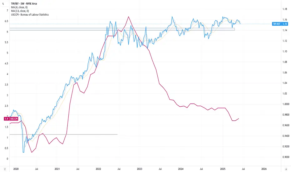
Bond Market - giving a warning sign?Typically, we would expect the TIP/IEF ratio to correlate with inflation. But that is NOT what we are seeing today. CPI is declining, but this ratio chart is implying that TLT is taking the brunt of it when compared to TIPS. This may be a warning signal that the bond market is discounting the of attractiveness of NASDAQ:TLT , whether due to expected issuance or underlying uneasiness of inflation rebounding. Worth monitoring here.
$PWR: The outperformer momentum stock within $XLIMany will say not all industrials are created equal. Some stocks give more α- than others. Within the SPDR Industrial subsector ETF AMEX:XLI we have stocks like Boeing which have done nothing for the last 5 years. On the other hand, we have midcap industrial stocks like NYSE:PWR , NYSE:TT and NYSE:GEV whose chart looks amazing and has clear uptrends. What is common among these industrial names? All these industrials provide solutions to the Generational AI Data Center Build Solutions. Quanta Services NYSE:PWR provides electrical and power solutions and components which go into building these data centers which need reliable power supply and high-quality equipment’s. In the chart below you can see the ratio chart of NYSE:PWR vs $XLI. This indicates the performance dominance of NYSE:PWR vs the industrial ETF AMEX:XLI with the ratio touching the lows of 0.4. So instead of buying the index AMEX:XLI , I would rather long NYSE:PWR over $XLI.
Coming back to technical the stock is in a clear uptrend. During the April Bear market, the stock NYSE:PWR took a plunge and lost almost 40% of the value and touched the 0.236 Fib Retracement level with RSI of 30. From the bottom of 230 $ the stock recovered 60% of its losses. With an RSI of 60 the stock is still not in overbought territory. If the stock follows the same price pattern and touches the upper limit of 4.236 Fib retracement level, then we can see a 380 – 400 $ stock before we turn cautious.
Verdict: Long NYSE:PWR over $XLI. Best industrial momentum stock. 400 $ target price.
